Accessibility

Image by Freepik
Earlier this term, Rebekah Cupitt introduced you to
some research on web accessibility in organizational contexts
common misconceptions and controversies
models of disability
models of accessible design
Building on this understanding, we will now dive into some of the practical steps you can take to make your web designs and projects more accessible.
Circumstances of accessible design
Recall this unified definition of accessibility from your reading (Helen Petrie et al):
“All people, particularly disabled and older people, can use websites in a range of contexts of use, including mainstream and assistive technologies; to achieve this, websites need to be designed and developed to support usability across these contexts.”
This definition helps us in several ways to remember a few key circumstances of accessible design:
Let us now go through just a few of the most common accessible design patterns, to get you started.
Just to note, we do not have space to cover everything about web accessibility in this segment. If you want a comprehensive introduction about on the level of this module, see “Learn Accessibility” at web.dev, which was also a big source of inspiration for the techniques and examples used here.
WCAG
The Web Content Accessibility Guidelines provide code-agnostic benchmarks for the design of presentational and interactive features of web applications.
The current WCAG version is based around four categories:
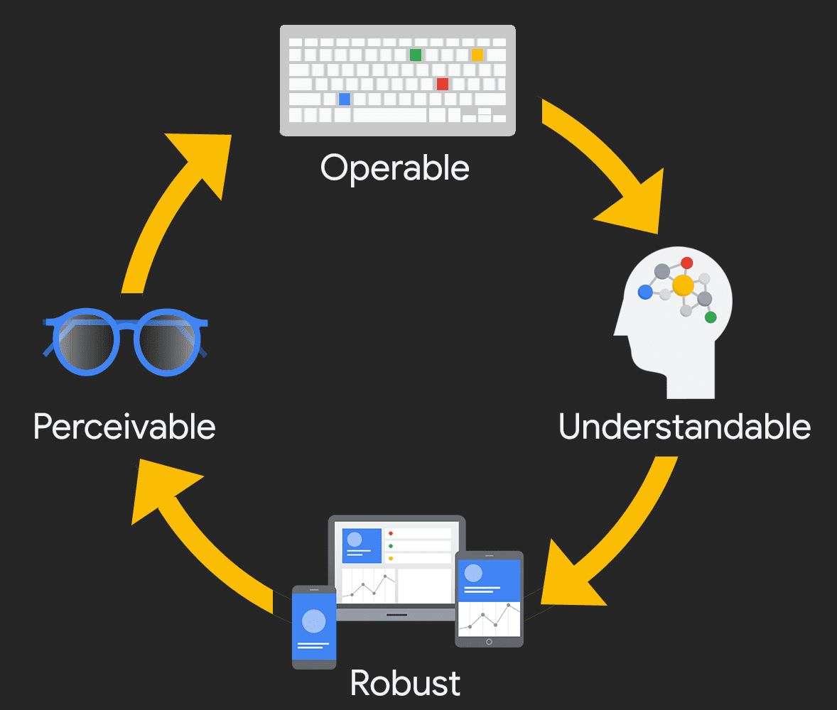
Image by web.dev. Licensed under CC BY 4.0
Accessible design so far
You have already learned lots of code patterns that meet WCAG criteria. Accessible patterns of HTML and CSS have become much more mainstream over the last 5-10 years. As a result, semantic HTML and responsive CSS are already accessible if used well.
| Category | Example |
|---|---|
| Perceivable | alt="my cat Bug waiting for lunch" |
| Perceivable | @media (max-width: 767px) {flex-direction: column} |
| Perceivable | color: white; background-color: darkolivegreen; |
| Operable | <title>About - My Website</title> |
| Operable | <nav><ul><li>About</li><li>Contact</li></ul></nav> |
| Understandable | <footer>My Footer</footer> <footer>My Footer</footer> |
| Understandable | <html lang="en-GB"> |
Keyboard usability
Many people use a keyboard to navigate through webpages. In some cases they are looking at the page while navigating, and others they are listening to it being read aloud.
Focus
When someone moves through a page using the keyboard, the browser tracks that movement with “focus”. This happens even with mainstream browser-keyboard combinations, without the use of a screen reader like NVDA.
TIP
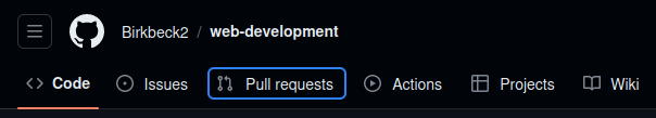
To get a feel for focus, press tab several times on website like GitHub.com
By default, links and interactive elements appear in focus, but most other elements do not. You can use HTML attributes to change this, as well as their order, but usually you should leave them alone.
More often, you will want or need to style the visual ring that shows up around a focused element. If you leave it alone, each user’s browser will use its own setting for the color.
Or you can target it in your CSS with the pseudo-class :focus.
:focus {
  outline: black 1rem solid;
}Skip links
On websites with large headers and navbars, keyboard users quickly grow tired of tabbing many times to reach the main content of the page, every time the page loads.
The solution is to create an internal link that targets the main content that becomes visible on focus.
<body>
  <div class="skip-to-main">
    <a href="#main">Skip to main content</a>
  </div>
<nav><main id="main">
<h1>The Seasons</h1>.skip-to-main a {
position: absolute;
top: -500px;
left: 0;
padding: 12px;
background-color: white;
}
.skip-to-main a:focus {
top: 0;
}INFO
CSS position is used to change up the default CSS box model. By using position: absolute and directional rules like top we can place an element independently of its siblings.
Color contrast
The colors used on a website can adversely affect you if you have color blindness or low vision. They can also affect you circumstantially, like if you are outside on a bright day or reading your phone at night.
Things to note:
You are more likely to have text background contrast issues with smaller text
Colors that look quite different to you might have low contrast, because the lightness of two colors might be similar even if the hue is different.
Because color is reducible to hex and RGB codes, there is a formula for determining contrast, so checking for contrast issues can sometimes be automated, and there are tools for helping you choose contrasting colors like WebAIM’s Contrast Checker or app.contrast-finder.org.
Here is an example of very poor contrast, even with “different” colors:
body {
  color: tomato;
  background-color: cornflowerblue;
}
View in browser (if you dare!)
Structuring pages with landmarks
Recall we discussed using landmark elements to announce the regions of a page.
<html>
  <head> </head>
  <body>
    <header>
      <nav>...</nav>
    </header>
    <main>
      <article></article> <!-- depends on content -->
      <section></section> <!-- depends on content -->
    </main>
    <aside></aside> <!-- depends on content -->
    <footer></footer>
  </body>
</html>TIP
Try inspecting this page and looking for the accessibility tree in your browser tools.
Screen reader users depend on these landmarks for a high-level overview of each webpage they visit. The browser creates a tree from the landmark elements that you can move through with assistive technology.
Augmenting HTML with ARIA
Most of the time, if you use modern HTML and CSS well, your website will be accessible. However, sometimes HTML needs extra help to create a great user experience for screen reader users.
ARIA (Accessible Rich Internet Applications) was created to provide this extra glue for HTML, with the intent of making it more accessible. When ARIA was invented in 2008, HTML was not very semantic, so a lot of work had to be done--you had to use a lot of ARIA. But now, you only need ARIA in a few cases.
For example, the section element needs a name for for screen readers to know what to do with it. ARIA provides the aria-label and aria-labeledby attributes.
<section aria-label="The best season of the year">
  <h2 id="autumn">Autumn</h2>
  <p>Leaves are falling.</p>
  <img src="images/autumn-leaf.svg" width="40" height="40">
</section>
<section aria-labelledby="spring">
  <h2 id="spring">Spring</h2>
  <p>Leaves are growing.</p>
</section>TIP
Check out the accessibility tree in browser tools to see the labels take effect.
Still think you need ARIA? Read about its history and rules of usage.
Check your understanding
Name some HTML and CSS techniques that you already knew how to do before today that contribute to accessibility.
True or false: The browser “focus” tracks where the mouse pointer is on the page.
True or false: A skip link is meant to help the user skip the navigation bar.
What problem might screen reader users have this markup?
html<body> <div> <h1>Important subject</h1> <p>I have something very important to tell you</p> </div> </body>Why is ARIA not needed so often any more?
References
Contrast-Finder. “Contrast Finder.” Accessed November 14, 2023. https://app.contrast-finder.org/?lang=en.
Fisher, Carie, Alexandra White, and Rachel Andrew. “Learn Accessibility.” web.dev. Accessed November 14, 2023. https://web.dev/learn/accessibility.
Myers, Ben, Brittney Postma, and Alex Patterson. “A11y with Ben Myers.” CodingCat.dev, September 7, 2022. https://codingcat.dev/podcast/2-38-a11y-with-ben-myers.
Myers, Ben. “How to Fix Your Low-Contrast Text.” Ben Myers, April 10, 2022. https://benmyers.dev/blog/fix-low-contrast-text/.
Petrie, Helen, Andreas Savva, and Christopher Power. “Towards a Unified Definition of Web Accessibility.” In Proceedings of the 12th International Web for All Conference, 1–13. W4A ’15. New York, NY, USA: Association for Computing Machinery, 2015. https://doi.org/10.1145/2745555.2746653.
WebAIM. “Contrast Checker,” 2023. https://webaim.org/resources/contrastchecker/.